2026’s Rich, Earthy Color Revolution Takes Over Homes and Galleries
For the past decade, “sad beige” reigned supreme in interiors—a sea of cool, flat grays and lifeless taupes that promised calm but often delivered emotional flatline. Think endless millennial-gray walls paired with minimalist furniture and zero personality. But as we step into spring 2026, that era is officially over. Maximalists, collectors, and homeowners craving warmth are embracing a vibrant new palette of rich, earthy tones that feel like a literal warm hug. These colors—deep umber browns, sunbaked ochre, pistachio-chartreuse, desaturated sky blues, and confident reds—are flooding living rooms, bedrooms, and yes, gallery walls.
Designers and trend forecasters from Vogue to Emily Henderson are calling it a full-blown revolution. “The ‘sad beige’ era of interior design is officially over,” declares a recent Vogue roundup. “We’re poised to embrace a kaleidoscope of eye-catching colors.” No more hiding behind safe neutrals. This is color with soul—grounded in nature yet elevated with intention. And it’s not just paint on walls. These hues are transforming how we live, collect art, and express ourselves at home. The result? Spaces that feel collected over time, emotionally resonant, and magazine-ready without trying too hard.
Why Sad Beige Had to Go
The shift didn’t happen overnight. Post-pandemic fatigue with sterile minimalism, coupled with a collective yearning for authenticity in uncertain times, set the stage. Cool grays felt cold and impersonal; flat beiges looked dated and soulless. “We’re craving warmth, tactility, and authenticity—palettes that soothe without surrendering style,” explains Kerrie Kelly of Kerrie Kelly Studio. Earthy vibrancy, as coined by designers Barry Bordelon and Jordan Slocum of The Brownstone Boys, is the evolution of neutral: “color that feels grounded but still has energy, like nature turned up a notch.”
Think sun-baked clay, olive richness, or honeyed wood—tones that behave like refined neutrals but carry depth and longevity. Unlike the muted earth tones of past decades, 2026’s version leans into subtle saturation. It’s restorative yet alive, perfect for layered, lived-in homes. Paint brands like Behr and Glidden echoed this in their 2026 palettes, leaning into terracotta urns, baronial browns, and warm mahoganies. Even Pantone’s influence (post its Cloud Dancer moment) pushed toward warmer, more emotional hues.
Homeowners aren’t just painting accent walls anymore. Full-room color drenching, upholstery in chocolate browns, and textured finishes are everywhere. The payoff? Rooms that anchor the soul while inviting joy.
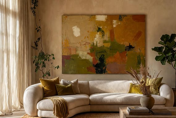
The New Palette: Five Earthy Heroes Dominating 2026
At the heart of the revolution are five standout colors, each with its own personality and perfect pairing potential.
Earthy Umber leads the charge. David Flack of Flack Studio (designer of Troye Sivan’s Melbourne home) predicts a surge in brown and umber-based tones: “Warm, muddy neutrals feel like a warm hug—they can command a larger space and a through-line with connecting colors throughout the home.” Whether deep red earth or rich dark brown, umber provides visual weight and anchors open-plan living. Pair it with wood tones for instant coziness or use it on cabinetry for quiet drama. It’s the new “neutral” that actually feels substantial.
Pistachio-Chartreuse brings playful energy without overwhelming. Marie Trohman and Ashley Drost of Proem Studio (behind Emma Chamberlain’s Los Angeles home) love its natural, down-to-earth vibe—more grounded than “brat green.” “This shade is striking and fun, and draws your eye very quickly,” says Trohman. Start small: a chartreuse-bordered rug, throw pillows, or even a statement sofa. It wakes up dark woods and pairs beautifully with the deeper earth tones, adding that fresh “pop” TikTokers are obsessing over.
Ochre (or burnt caramel/amber) delivers sunbaked, lived-in warmth. Austin designer Annie Downing calls it a favorite: “It brings a sunbaked, lived-in quality to a room and pairs beautifully with both antiques and modern pieces.” Yellowish-orange or terracotta-leaning, ochre works on walls, upholstery, or tiles (especially zellige in bathrooms). Emily Henderson highlights amber as a “rich, unctuous throuple marriage between rust and mustard… and brown”—less heavy than chocolate but just as fashionable.
Desaturated Sky Blue and Confident Red round out the family. The former, soft and versatile, “goes well with every neutral everybody has painted their house in the last four years,” per Trohman. It plays nicely with wood and acts as a calming bridge. Red (or burgundy/oxblood) adds bravery: “Fewer ‘safe’ choices, more personality,” says Downing. Use it on a statement wall or velvet sofa for instant drama.
These aren’t fleeting fads. They layer seamlessly—umber walls with ochre rugs, pistachio accents against sky-blue trim—and age beautifully with natural textures like linen, stone, bronze, and wood.
Where Art Meets the Revolution: Oversized Statements and Collector Walls
This color shift isn’t happening in isolation. The art world is responding in kind, with large-scale pieces and earthy palettes dominating gallery shows and collector homes. “Really big art” is the mantra for 2026 interiors—oversized abstracts, figurative works, and textured landscapes that command attention against these rich backdrops.
Modern large wall art trends emphasize “neutral yet rich palettes: Earthy, warm tones are dominating interiors.” Nature-inspired abstracts with softened edges, bush-and-coast palettes, and organic shapes are everywhere. Think moody figurative paintings in umber and ochre tones popping against pistachio upholstery, or chaotic abstracts in terracotta and mossy green that feel like an extension of the room itself.
Art trends expert roundups confirm: “Earth Tone Colors is a 2026 art trend defined by warm, nature-inspired hues like terracotta, moss green, ochre, teal, and espresso that create grounded, cohesive interiors.” Emotional abstracts and textured pieces add tactility, making them ideal companions for the new maximalist-yet-thoughtful aesthetic. Collectors are mixing heirloom oils, new gallery finds, and even fiber art into vignettes that feel personal rather than pristine.
Galleries report surging demand for works that bridge craft and fine art—textured canvases, hand-stitched elements, and biophilic motifs that echo the home’s earthy palette. Oversized cloud studies, Kyoto-inspired minimalism, or neo-Art Deco collages look especially striking in these spaces. The result? Homes where art isn’t an afterthought but the emotional core—anchoring a room while inviting conversation.
How to Bring It Home: Practical Tips for Readers
Ready to ditch the sad beige? Start small to build confidence. Swap one neutral sofa for an ochre or umber velvet piece. Add pistachio pillows or a chartreuse throw. Paint a powder room in deep plum or desaturated sky blue for low-commitment impact.
For bigger moves, color-drenched walls in umber create instant drama—pair with white trim and natural wood for balance. Layer textures: woven rugs in terracotta, linen curtains in khaki, and bronze lighting. Don’t forget plants and vintage pottery—they amplify the biophilic, grounded feel.
When collecting art, scale up. A large abstract (at least 60 inches) in earthy tones will ground an open wall. Mix periods: antique landscapes next to contemporary figuratives. Gallery walls thrive here—mix framed works with floating shelves holding ceramics in complementary hues.
Avoid pitfalls by testing samples in natural light (these tones shift dramatically). Balance deep colors with lighter accents to prevent heaviness. And remember: imperfection is in. These palettes forgive lived-in clutter, making homes feel warm and welcoming rather than showroom-perfect.
Designers like Heidi Caillier and Zoe Feldman are already showing the way—khaki bases with plum surprises, chartreuse curtains against brick tones. The message? Color is back, and it’s kinder, warmer, and more personal than ever.
The Future Feels Like a Warm Hug
As 2026 unfolds, the rich, earthy color revolution signals something deeper: a return to humanity in our homes. No more hiding behind safe, soulless neutrals. These tones invite us to feel, collect, and live boldly—anchoring spaces with visual weight while lifting spirits with subtle vibrancy.
Whether you’re repainting your living room, curating a new gallery wall, or simply swapping pillows, this trend rewards bravery. The sad beige era is dead. Long live the warm hug.
(Word count: 1,512)
Sources
- Vogue, “These Colors Will Be Everywhere in Interior Design in 2026” (January 2026)
- Style by Emily Henderson, “These 7 Colors Are Going To Be All Over Our Homes” (January 2026)
- Good Housekeeping, “‘Earthy Vibrancy’ Is Poised to Become 2026’s Defining Color Trend” (December 2025)
- Additional insights from iCanvas, KSAVERA Art, and Artshra 2026 trend reports on large-scale and earthy art palettes.
